Company: National Film Board of Canada Role: Concept, strategy and production (the videographer, director and editor was KyVy LeDuc) Challenge: Why did I insist on an unboxing video featuring Alanis herself? Because the data I’ve gathered in the last year or so at the NFB demonstrates that Alanis content will reliably find itself among our social media’s top 5 in any given month. Unboxing videos also happen to be a popular format that we see on social media, especially among Indigenous influencers, who are tapped into the latest social media trends. Result: This video was published in February 2024 on the NFB’s Facebook, X and Instagram platforms, and was in our top 5 on each platform that month.
A Strong Start
Company: National Film Board of Canada Role: Concept and strategy Challenge: When I started analyzing the performance data for the NFB’s social media platforms, I noticed that our average view times were a little low, and I wanted us to do better. So I had the idea of including catchy, sometimes even shocking text at the beginning of some of our excerpts. This text tells viewers what to expect from the video and allows them to decide early on whether or not they want to stick around to view the rest. Result: Since I started implementing these texts, and A-B testing them as thumbnails, our average view times have increased and videos with texts at the beginning consistently find themselves in our monthly top 5s.
Quote-Videos
Company: National Film Board of Canada Role: Concept and strategy Challenge: Quote-videos are another format that’s quite popular on the NFB’s social media account. Each time I publish one, it inevitably ends up in our top 5 that month, with a high number of views and excellent engagement numbers. I experimented with this format because it’s popular on platforms like TikTok, and tends to work well when the person whose quote we’re seeing play out on the screen happens to say something poignant. Result: Our quote-videos reliably end up in our top 5s, especially on X.
Memeification
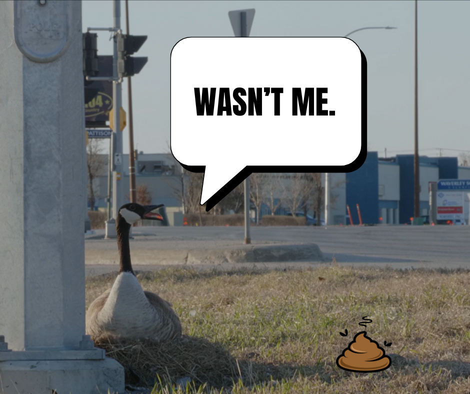
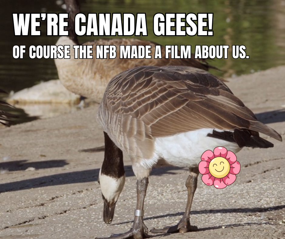
Company: National Film Board of Canada Role: Concept, strategy and design Challenge: It’s not often that we lean into humour at the NFB, so I felt it was high time to disrupt that streak. And we had the perfect film for it: Modern Goose. It has everything we need to create funny memes, namely, an animal so hardcore, its alternative name is the Cobra Chicken. Sure, I relied on poop jokes, but isn’t that appropriate for the Canada Goose? Result: The first of these posts (We’re Canada Geese…) has garnered more shares than usual, and overall engagements are higher than other posts from March 2024.
NEIGHBOURHOOD MAP SERIES
Client: Ville de Montréal Publication: Montreal Gazette Role: Producer, concept Notes: These maps were used to promote a series of neighbourhood tours in each of Montreal’s 19 boroughs. Published both in print and online, this campaign garnered a huge audience, with readers even writing in to let us know they were collecting the print versions of the maps. They didn’t even realize it was sponsored content! Check out the entire series here.
Outremont
Verdun
Lachine
Villeray
St-Henri
Île Bizard
EASTERN TOWNSHIP WINERIES
Client: QuébecOriginal (provincial tourism board) Publication: National Post Role: Producer, concept Notes: Part of a 3-story campaign encouraging people to explore Quebec’s Eastern Townships, the article on wineries found its readership very quickly. We used the first person to immerse the audience in our writer’s authentic experience. Read it here.
WHAT’S COOKING?
Client: Meyer Canada Publication: National Post Role: Producer, concept (video & article) Notes: What better way to showcase cookware than to demonstrate what you can do with it? Namely, delicious food! Not surprisingly, the recipe video gained hundreds of thousands of views when we posted it on Facebook. See the full story here.
QUEENS OF EGYPT
Client: Pointe-à-Callière Publication: Montreal Gazette Role: Producer, concept Notes: Are you an armchair Egyptologist? So is everyone. We knew people would love photos of ancient Egyptian artefacts, which is why we delivered just that to them, along with fascinating details about the lives of the queens featured in this exhibit. The audience flocked to this story in large numbers. Read the story here.
PRIVATE EDUCATION
Client: Multiple private schools Publication: Montreal Gazette Role: Executive producer, concept Notes: Each year, we do the private education special in the same way, in print. In 2019, we upped the ante by creating an interactive web page to complement our coverage of private schools. We also found interesting ways to give each advertiser equal share-of-voice in this interactive environment. View the page here.
THE GREAT URBAN REBUILD
Client: Concordia University Publication: Montreal Gazette Role: Writer, concept (stories, infographics & videos) Notes: How do you talk about the amazing research your university is advancing? You focus on the researchers. This 10-part series flaunted forward-thinking ideas for every aspect of urban development, with contributions from some of Concordia’s greatest experts. The series was successful with readers, and also won the prize for Best Native Execution at the INMA global media awards. Check out the series here.
Client: Concordia
MONTRÉAL EN HISTOIRES
Client: Ville de Montréal Publication: Montreal Gazette Role: Producer, concept Notes: Do you know what it takes to create dozens of unique scenes and project them onto various surfaces in Old Montreal? This infographic gives you the answer you may or may not have been looking for.
SPACIAL Working at Spacial was so much fun. I got to work on a huge variety of projects, like direct email campaigns and ads. Art Directors: Philippe Deniger (direct email) & Mike Young (ad).
AIR CANADA VACATIONS There are so many ways to tell people to take a vacation. Art Director: Guillaume Brière.
VEUVE CLICQUOT In this lovely PR campaign, we sent journalists postcard packages, encouraging them to send some to the “great ladies” in their lives. It’s the kind of thing Madame Clicquot would have done. Art Director: Leïla A.
BELL CANADA This poster was pitched to Bell Canada to announce their IPTV system. Art Director: Georges Chartier.
RoC This point-of-purchase campaign was seen in most Canadian pharmacies in 2007 and 2008.
NHC INSTITUTE The NHC Institute trains the next generation of naturopaths and other practitioners of complementary medicine. This campaign sought to remind the public of the underlying causes of many illnesses. Art Director: David LeBlanc.
STATION MARKETING Most marketing agencies send their clients a self-fashioned holiday greeting card. Here’s what we sent in 2005. Art Director: Leïla A.
No one asked me to do these, but they should have.
ORCHESTRE SYMPHONIQUE DE MONTRÉAL Most of what we know or like about music is rooted in the classics.
BOSCH DISHWASHERS When my husband and I first got a dishwasher, I called it the “Relationship-Saver 3000.” Bosch’s slogan at the bottom is their own, but it ties into the concept really well.
LASALLE COLLEGE It’s hard to be an original in the world of fashion, but those who are rarely go unnoticed. I wanted to focus on that in this mock campaign for Lasalle’s International School of Fashion, Arts & Design.
The husband unit and I haven’t had a date night in ages. It’s not neglect; it’s the result of a particularly eventful summer that had us moving to our new, decidedly grown-up digs. The final piece of furniture arrived in mid-September, followed by a non-stop whirlwind of fall festivities: Thanksgiving, a visit from Mum, my birthday, Halloween, not to mention a business trip to Orlando.
So it’s our first week with nothing much to do, and I suggest a date night. This usually means a movie at the Cineplex. Based on what I’ve written for Roger Ebert, you might think I’m all art-house, but AMC movies aren’t the husband unit’s cup of tea (and he’s British, so boy knows tea). We always manage to find a happy medium at the Cineplex anyhow, so best to just sit back and let Big Hollywood do all the work.
The movie we settled on? Contagion, which was playing – surprisingly – at the compound’s only IMAX theatre. And you know, I get it about the IMAX, but I still thought it was a strange option for a Soderbergh.
I’m often irked by the IMAX experience. I’m far-sighted and the screen, even in the last row, always seems too close, too bright. The dated IMAX intro is also tedious. But nothing irritates me more than those pointless pre-movie adverts, which are all the more grating when you’re forced to be exposed to them on an even bigger screen.
Maybe it’s because of the screen’s size that I was struck with how each of those ads was a missed opportunity. Here I am, stuck in the theatre – a captive audience – and each ad gives me an incentive to look away and keep reading Cineplex magazine. It’s not the random array of products being pushed that bugs me; it’s that these companies are trying to push them on me like I’m watching TV. But I’m not watching TV; I’m at the movies. I’m not watching a serial story that’ll continue next week at the same time; I’m about to take in a story that’ll engross me and wrap up in about 2 hours. And a bigger version of an ad intended for a domestic audience just doesn’t suit the cinema.
Like most people – even if few will admit it – I don’t mind being genuinely entertained by great advertising. But there’s more than one way to do it on a screen. Not so long ago, BMW launched a fantastic, web-only, short movie campaign starring Clive Owen. The most popular was probably the shorty featuring Madonna:
But there was a worthy one with James Brown, as himself, trying to get his soul back from the Devil, played by Gary Oldman:
Recently, Philips hosted a short film contest where people had to interpret 5 lines of ambiguous dialogue any which way they pleased. In other words, Philips didn’t even make the winning movies, but they own them now, which gives them distribution rights. Of course, the fashion industry has been doing this sort of thing longer than we’ve been talking about it. All of this is branded content that’s actually enjoyable.
Our favourite pre-movie ads – those we look forward to and hate to miss – are movie trailers. So imagine if we filled some of that extra space with short films. If it helps Cineplex pay the bills, I’d like to see more companies take the time to produce something that’s designed for the experience I’m already paying to have. I also hope that space would be sold to advertisers at a reasonable rate.
We want movies at the movies. As an advertiser, I don’t expect you to know what I like. But I should hope you’ll always keep in mind where I am, what I’m doing there, and how to speak the language.
In the advertising world, there’s something the scares the crap out of clients: blank space.
“Can we put something in the top half? It looks a little empty,” they might say. “Shouldn’t we make the discount burst a little bigger?” Or even, “It’s great, but I think it could jump out a little more.” And that’s how a strong ad concept turns into an instruction manual.
Clients become terrified that customers will not interpret a message in a specific way, aiming all manner of doubt at their audience’s intelligence. Yet some of the most effective campaigns in advertising history were practically bare: The Economist, I’m a Mac, Nike’s “Just do it.” Incidentally, none of these companies bothered to offer discounts.
In art, negative space is the space around a subject. In certain exercises, students are taught to see that space as an artistic entity in itself. It adds weight to the subject. It defines its role on the canvas. It allows you to zero in on an idea.
There were two movies at Ebertfest that struck me with a penchant for riffing on that negative space, not to mention a palpable faith in their audience: Tiny Furniture and 45365. Neither of these felt the need to take you by the hand and guide you through their narratives, and these pictures were so tightly focused that it wouldn’t have been necessary anyhow.
It’s fitting that one of my fellow Far-Flung Correspondents described Tiny Furniture as a series of “white people problems.” Of course, he was right. The main character Aura, played by writer-director Lena Dunham, returns home to NYC after completing her Fine Arts degree at a college in Ohio. She’s also just been dumped by her hippy boyfriend, who’s going to work on a hippy project involving trees. Her mother is a famed artist, whose success managed to score the posh multi-level apartment Aura comes home to. Her life screams privilege and culture. All that’s missing is refinement, as evidenced by her bratty behaviour.
Aura is surrounded by blank space, literally. Her mother’s apartment is rife with white surfaces, from the walls to the floors and counters. It frames the characters and amplifies their proportions. It lets the dialogue’s constant subtext cameo its way to the surface. For instance, when Aura asks her mother where the scotch tape is, her mother tells her it’s in the white cupboard. What’s funny is that there are, of course, about 15 identical cupboards to choose from. What’s telling is that Aura knows exactly which one to open.
The white space also serves to highlight Aura’s isolation. It’s here that she works through her post-graduate confusion, disobeys her mother’s reasonable ground rules, and loses an existential turf war against her younger sister. In the same way, her romantic endeavours fail because of a her inability to assert herself, because she keeps using the words that exist outside the ones she should say.
The documentary 45365 comes from the vérité tradition, which has become a rarity in the past few years. Lately, it seems documentary funding falls mostly in favour of political exposés with talking heads, panning still images and little room for free association. There isn’t anything wrong with that – like most people, I enjoyed Supersize Me and what should be its companion, Food Inc. – but this trend looks less like cinema and more like a special report on the nightly news.
Directed by brothers Bill and Turner Ross, 45365 takes place in their hometown of Sidney, Ohio, bearer of the eponymous zip code. Having left that town years ago, presumably to pursue motion picture dreams, it would have been easy for the Ross brothers to portray Sidney with an air of condescension or to turn it into a message movie. Some of the perennial ingredients are even there: poverty, drug deals, an election. Instead, 45365 chooses to show us the intermingling realities of this small town. It follows certain people and their story arcs, it captures clips of non-contextualized conversations and it eavesdrops on intimate moments. There are no gimmicks or scandals, and it’s riveting. The Ross brothers are enchanted by their hometown, as are we.
In this film, negative space is everything we don’t know about these charming little vignettes. It’s everything we have to imagine or infer. Once we’ve gone through the exercise, we realize that what was in the final reel is all we really needed to understand the story. And not a drop more.
[vimeo 4069881]
Both Tiny Furniture and 45365 rely heavily on pitch-perfect cinematography to heighten the viewing experience. It may seem like a given, but when you consider that a stunning movie like Inception spent most of its time telling rather than showing, you have to wonder.
What I especially appreciate is how the directors of both films trusted us with their experiments in rustic storytelling. Do we need their help in grasping some of the finer points? Not really. And we got there anyway.
To cap off what’s been a surprisingly successful series on the ‘90s, I want to impart some wisdom that could very well save our culture. Not everything from the ‘90s is worth hanging on to. So when we plan our revival, let’s carefully curate the things we revisit and leave these duds behind.
1. The laugh track
No, it wasn’t invented in the ‘90s, but near the end of the ‘90s, good writing started to phase it out. Shows like Dream on, Ally McBeal and Sex and the City proved that people could laugh in all the right places without taking cues from a phantom audience. Sure, the ‘90s gave us Seinfeld and Frasier, but they were also responsible for Caroline in the City, Just Shoot Me and The Fresh Prince of Bel-Air. When you look back at some of these, it’s staggering how un-funny they are. Such punchline-driven cheap shots. Such meaningless catch phrases (or in the case of The Nanny, a series of grating groans). So will someone please send Two and a Half Men back to 1995 where it belongs? We’ve got 30 Rock and The Office now. We’ll just take it from here.
2. Dimestore spirituality
Though I’m not the biggest fan of self-help, some of it speaks on a tangible, grounded level. Unfortunately, the ‘90s wanted to balance that out with a new brand of New Age, and it was never very clear what doctrine a person was following. Oprah’s “Remembering your Spirit” segment invited guests to describe their calming rituals, like drawing a bath or, in the case of Martha Stewart, berating the help. Books like The Celestine Prophecy became hugely popular, and despite being a work of fiction, some still adhered to some of its proposed “insights.” And TV producers played fast and loose with Christian dogmas to make Touched by an Angel and Seventh Heaven more mainstream. The ensuing melting pot didn’t use the best ingredients, just the most popular.
3. Whiny pop that tried so, so hard to sound like alterno
Grunge did something to the music industry. It opened up a whole new market. But true-blue grunge artists cared a lot more about the music than their labels did. So labels started working with musicians who were willing to follow orders. That’s how we ended up with the radio-friendly, easy-listening drivel of the Goo Goo Dolls, the Gin Blossoms and that Friends band. There’s still some of that going around today. You have the Stereos, who are just enough emo to bellyache through each song, just enough rock to distort their guitars, and just enough hip-hop to sing every note on auto-tune. It’s just awful. And hopefully it’ll move back in with its mother Cher, circa “Believe.”
4. Khakis
Despite one very enticing Gap ad campaign, khakis just don’t look as good on people who aren’t professional dancers or models. They seem so promising because they’re classic, but that doesn’t translate into staying power when the trend resurfaces. So this time around, if the khaki comes back, let’s just act like we don’t know it.
5. Will Smith
He and I were cool until he became a Scientologist.
I actually liked the Fresh Prince in Six Degrees of Separation. Why didn't he go all Stockard Channing instead of Tom Cruise?
Why doesn't anyone click on these? The answer: what's in it for them?
It’s happening. Slowly, but eventually, it’ll be widespread. Online editions of some of our favourite newspapers are going behind a paywall. It makes sense: they have to break even, and it’s getting harder. So the New York Times, which has enjoyed a considerable online readership but a significant dip in print subscriptions, is soon only going to be available to those who are willing to pay for the privilege. In a way, it’s how it should be, though I can’t help but feel that they missed the mark when it came to online advertising.
Let’s backtrack a little.
When I worked as a copywriter with a major travel agency, the sharpest thorn in my side was no doubt wielded by our media buyer. She and I rarely worked together directly, but her reckless media bookings often put me in a position where I had to create an ad for an audience that simply wouldn’t be at its most receptive. Once, I even had to combine Asia and South America, as general destinations, in one ad. “What’s the problem?” she said. “You’re the writer. Just do it!”
And I did. Awkwardly, but I did. Then it dawned on me that we had it backwards. She shouldn’t be telling me what to create; I should be telling her what space to buy, and where, and when. In advertising, creatives don’t just put the ads together. We take cues from the audience, the potential medium and the medium’s potential to stage a strategic dialogue. So really, creatives are in an ideal position to tell sales departments what to sell and how to sell it.
This isn’t news. You can see that this is the kind of conversation sales departments are having with advertisers right now, simply because some ads are clearly so mindful of where they are and who they’re talking to. It’s why a designer ad in American Vogue will mimic the fantasy of a Grace Coddington spread, but won’t in the U.K. edition that same month.
Yet when it comes to advertising on the web, it’s shocking how the whole team – creatives, sales and advertisers – can’t seem to apply the same principles. Advertising is most effective when it’s part of the experience people are already having with a medium. If we use Vogue as an example again, a majority of the ads look like they could have been produced by the magazine’s art team. In Wired, you’ll often find ads that simulate the quirky, interactive design of their front-of-book pieces. So when you’re flipping through the pages, you might be fully aware that you’re reading an ad, but at least it’s speaking your language.
A Wired ad that looks like editorial.
On the web, creatives and advertisers both seem to draw a blank. More often than not, they opt for a banner ad that nobody’s going to click on, which is something I’ve seen even on the New York Times website. Thing is, nobody was clicking on banner ads and pop-ups in the early days of the dot.com boom, so it’s surprising that it’s still being used today. Yet it’s not an easy equation to figure out, because the answer isn’t the same for everybody, and the answer changes depending on the website you advertise on.
Where print and outdoor advertising are ideal for a more subtle approach, the web is perfect for straightforward messaging. The immediate nature of the medium means you should get to the point, and quickly. Do it right, and you’ll have people clicking directly to your site. Do it effectively, and it’ll lead directly to sales (something that’s always been difficult to track in traditional advertising).
Deals found when you search hotels in Athens.
It’s a simple matter of figuring out where and when people are already looking for your product. Trip Advisor does this well. As a user, you’re only going there for one reason: to find a hotel that’s gotten decent “peer” reviews. Once you’re on the site, Trip Advisor generates ads that vary from specials to suggestions, and are wholly relevant to your search entry. Using Trip Advisor’s templates, the ads are integrated into your interaction with the website and are actually quite useful to you during your experience. I think it’s also notable that Trip Advisor spent a lot of time and money developing such a smart search engine.
Gossip or ad? Perez readers know the difference, and don't mind being entertained.
None of this means that good creative has to be tossed aside. There’s a place for it too, so long as there’s a sound strategy behind it. I’ve seen this on Perez Hilton a few times, and here, we’re looking at decent examples of awareness campaigns. Though Dirty Sexy Money became an unfortunate casualty of the Writers’ Strike, marketers for the program were brave enough to experiment with new territory. They inserted ads on Perez Hilton that looked like the blogger’s own gossip entries. Though the DSM posts were differentiated with a yellow background and the word “advertisement” on the bottom right corner, the periodic entries treated the fictional Darling family as one that garnered as many scandalous headlines as Lindsay Lohan. In some cases, the ads even featured Perez Hilton’s distinctive MS Paint scrawlings.
Perez Hilton’s site background is also up for grabs. Though the results vary, when Mariah Carey’s marketers used it to plaster her new album cover, Perez looked like a sell-out and the singer seemed like a good sport. What made this effective, I think, was that people going to Perez Hilton already had a relationship with Mariah based on the blogger’s constant remarks about her oddball behaviour or questionable sobriety. So here, we have editorial content weaving its way into the ad campaign, if in a tongue-in-cheek manner. And this is the sort of thing that media buyers aren’t always aware of, but that creatives tend to look for.
A sponsor link on Wired.com advertising jobs that readers might be looking for anyway.
Not that I believe news sites should rely on the advertising model to rake in revenue. But if online subscriptions don’t pan out, these sites may find themselves re-evaluating more efficient advertising campaigns. I don’t think the answer is to embed marketing messages in editorial content (at least, not more than they already are). Instead, news sites, or even blogs, should seriously consider what it is that their readers are already looking for, and find companies that can enhance the experience for the reader. When readers click, it signals relevance. When they don’t, it’s because they’re being advertised to. People ignore most ads on TV, in print, and on a highway. Why would it be any different online?
In the little bit of time I worked at Cossette, one of the senior copywriters took me under her wing. Perhaps because she picked up on my insecurities about having gone from rinky-dink agency to big-time ad firm in one leap. Or maybe because we had the whole “writes English but was brought up French” thing in common. In any case, we were assigned to work together on a project, and when I made changes that involved turning an imperative into a passive, she immediately vetoed it. I wondered why, so she explained that our project was instructional. You have to use the imperative because it provokes a response, and that’s what you need when the the people you’re talking to are learning something. “Know your audience,” she said.
I loved two things about that sentence.
First, in the ad world, you’re constantly referring to targets, markets and demographics. Rather scientific categorizations, necessary though they are. On the flip side, the word “audience” doesn’t connote the idea of people; it very plainly spells it out. There’s no separation between yourself, people and the thing you use to measure them. It’s just you and the people looking at you.
And second, it’s not enough to acknowledge your audience. You also have to say, “Hey! You, over there, in the white t-shirt. I know who you are!”
Since then, I left the ad world, returned to journalism, and then found myself kind of doing both. The two professions aren’t as different as people think they are. In both cases, you have to be extremely mindful of the people watching you, because what you say weaves itself into who they think they are, and what they think they know. The method is different, but the outcome is pretty much the same.
Yet, like anyone who work in words, you end up doing some stuff just for yourself. You can’t help it. They’re your words, your expressions, your choices, and your stream of consciousness. If you can’t take ownership of these things, you’ll be as compelling as a dictionary.
Here’s the real kicker, though. Without your audience, your words don’t exist. Sure, they’re still in that dictionary, but they don’t come from you or from anywhere, therefore you don’t exist. Not as a writer, anyway.
And I tell you what: I was more or less comfortable with that arrangement until Roger Ebert started following me on Twitter, and took it upon himself to link to my blog. The whole thing boosted my readership and followers by a hefty 500%. And just like that, I had to wave goodbye to self-indulgence.
Of course I’m flattered that Roger Ebert, who I’ve been reading for about 12 years, would even give my blog a second glance. It’s just that now I’m faced with an audience I didn’t have before, and I don’t know anything about you. Naturally, I’m grateful. I write this blog because I want to reach out to people to begin with. But if my blog stats are any indication, there’s a good chance that the majority of you who were reading me pre-Ebert were my friends. (By the way, thanks buds!)
So here’s a challenge. Why’n’t you tell me a little about yourself? If I’m not just writing for my friends anymore, I’d like to know why you stopped by.
On that note, Roger Ebert, an avid Twitter user, has made it a point to link to many blogs (after paying them a visit). Today, he led us to Miss Banshee’s blog, which, on top of being hilarious, balances confession and control. She really puts it all out there, but she doesn’t name names. Know what I mean?
I wish I could do that, but, if I’m honest, I don’t think I could even out the tensions as delicately as she does. Not until I get a better look at you, anyhow.
Though I absolutely fell in love with the Niagara region, it has the unfortunate plight of being attached to Niagara Falls, which is, from every angle, a one-trick pony. It’s not a bad thing. I think the town knows it and does its best to help you see what you came to see from every angle, and at a very reasonable price.
In a way, it makes me wish certain companies were more comfortable with the fact that one of their given products doesn’t do it all, and won’t satisfy every need or every demographic.
Take Grumly, the teddy bear that only has one distinguishing quality: squeeze its tummy and it lets out a slightly sustained grumbling sound. Otherwise, it doesn’t look like much. But you have to love how the ads zero in all the things Grumly is not. It kinda makes you feel for the guy. My French friends will have to tell me whether or not Grumly became as popular as these ads should have made him.
Scott Monty, Ford Motor Company’s head of social networking, took the time to read my rather lengthy blog entry on new marketing, and responded…twice!
I don’t know how Scott Monty came across my rinky-dink blog, or why he read it, but he did, and was kind enough to leave some constructive thoughts to boot. As I said before, I like a Mom ‘n’ Pop shop. Perhaps proving his point rather than mine, I felt I should at least give the Monty a richly deserved nod.
I’ve never really thought about buying a Ford, or any car (living in Montreal will do that), but if I did, I’d definitely want this one.
Do they come in a hybrid?
p.s. I have no idea how Scott Monty does it, but he’s everywhere! He’s the new Santa Claus.